HTML: The Living Standard
Edition for Web Developers — Last Updated 20 July 2026
Edition for Web Developers — Last Updated 20 July 2026
details elementSupport in all current engines.
summary element followed by flow content.name — Name of group of mutually-exclusive details elements
open — Whether the details are visible
HTMLDetailsElement.The details element represents a disclosure widget from which the
user can obtain additional information or controls.
As with all HTML elements, it is not conforming to use the details
element when attempting to represent another type of control. For example, tab widgets and
menu widgets are not disclosure widgets, so abusing the details element to
implement these patterns is incorrect.
The details element is not appropriate for footnotes. Please see the section on footnotes for details on how to mark up footnotes.
The summary element child of the element, if any,
represents the summary or legend of the details.
The rest of the element's contents represents the additional information or controls.
The name content
attribute gives the name of the group of related details elements that the element is
a member of. Opening one member of this group causes other members of the group to close. If the
attribute is specified, its value must not be the empty string.
Before using this feature, authors should consider whether this grouping of related
details elements into an exclusive accordion is helpful or harmful to users.
While using an exclusive accordion can reduce the maximum amount of space that a set of content
can occupy, it can also frustrate users who have to open many items to find what they want or
users who want to look at the contents of multiple items at the same time.
A document must not contain more than one details element in the same
details name group that has the open
attribute present. Authors must not use script to add details elements to a document
in a way that would cause a details name group to have more than one
details element with the open attribute
present.
The group of elements that is created by a common name attribute is exclusive, meaning that at most one of the
details elements can be open at once. While this exclusivity is enforced by user
agents, the resulting enforcement immediately changes the open attributes in the markup. This requirement on authors
forbids such misleading markup.
A document must not contain a details element that is a descendant of another
details element in the same details name group.
Documents that use the name attribute to group multiple
related details elements should keep those related elements together in a containing
element (such as a section element or article element). When it makes
sense for the group to be introduced with a heading, authors should put that heading in a heading element at the start of the containing element.
Visually and programmatically grouping related elements together can be important for accessible user experiences. This can help users understand the relationship between such elements. When related elements are in disparate sections of a web page rather than being grouped, the elements' relationships to each other can be less discoverable or understandable.
The open content
attribute is a boolean attribute. If present, it indicates that both the summary and
the additional information is to be shown to the user. If the attribute is absent, only the
summary is to be shown.
The following example shows the details element being used to hide technical
details in a progress report.
< section class = "progress window" >
< h1 > Copying "Really Achieving Your Childhood Dreams"</ h1 >
< details >
< summary > Copying... < progress max = "375505392" value = "97543282" ></ progress > 25%</ summary >
< dl >
< dt > Transfer rate:</ dt > < dd > 452KB/s</ dd >
< dt > Local filename:</ dt > < dd > /home/rpausch/raycd.m4v</ dd >
< dt > Remote filename:</ dt > < dd > /var/www/lectures/raycd.m4v</ dd >
< dt > Duration:</ dt > < dd > 01:16:27</ dd >
< dt > Color profile:</ dt > < dd > SD (6-1-6)</ dd >
< dt > Dimensions:</ dt > < dd > 320×240</ dd >
</ dl >
</ details >
</ section > The following shows how a details element can be used to hide some controls by
default:
< details >
< summary >< label for = fn > Name & Extension:</ label ></ summary >
< p >< input type = text id = fn name = fn value = "Pillar Magazine.pdf" >
< p >< label >< input type = checkbox name = ext checked > Hide extension</ label >
</ details > One could use this in conjunction with other details in a list to allow the user
to collapse a set of fields down to a small set of headings, with the ability to open each
one.
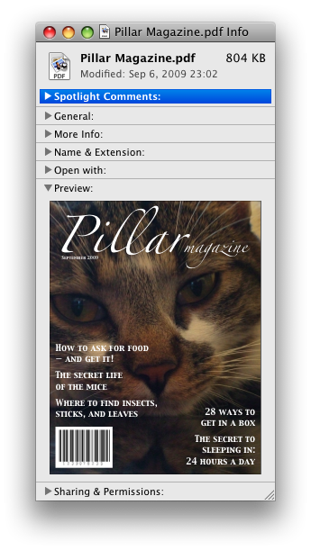
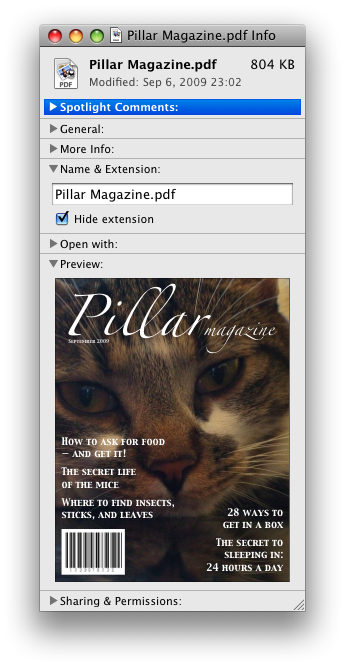
In these examples, the summary really just summarizes what the controls can change, and not the actual values, which is less than ideal.
The following example shows the name attribute of the
details element being used to create an exclusive accordion, a set of
details elements where a user action to open one details element causes
any open details to close.
< section class = "characteristics" >
< details name = "frame-characteristics" >
< summary > Material</ summary >
The picture frame is made of solid oak wood.
</ details >
< details name = "frame-characteristics" >
< summary > Size</ summary >
The picture frame fits a photo 40cm tall and 30cm wide.
The frame is 45cm tall, 35cm wide, and 2cm thick.
</ details >
< details name = "frame-characteristics" >
< summary > Color</ summary >
The picture frame is available in its natural wood
color, or with black stain.
</ details >
</ section > The following example shows what happens when the open
attribute is set on a details element that is part of a set of elements using the
name attribute to create an exclusive accordion.
Given the initial markup:
< section class = "characteristics" >
< details name = "frame-characteristics" id = "d1" open > ...</ details >
< details name = "frame-characteristics" id = "d2" > ...</ details >
< details name = "frame-characteristics" id = "d3" > ...</ details >
</ section > and the script:
document. getElementById( "d2" ). setAttribute( "open" , "" ); then the resulting tree after the script executes will be equivalent to the markup:
< section class = "characteristics" >
< details name = "frame-characteristics" id = "d1" > ...</ details >
< details name = "frame-characteristics" id = "d2" open > ...</ details >
< details name = "frame-characteristics" id = "d3" > ...</ details >
</ section > because setting the open attribute on d2 removes it from d1.
The same happens when the user activates the summary element inside of d2.
Because the open attribute is added and removed
automatically as the user interacts with the control, it can be used in CSS to style the element
differently based on its state. Here, a style sheet is used to animate the color of the summary
when the element is opened or closed:
< style >
details > summary { transition : color 1 s ; color : black ; }
details [ open ] > summary { color : red ; }
</ style >
< details >
< summary > Automated Status: Operational</ summary >
< p > Velocity: 12m/s</ p >
< p > Direction: North</ p >
</ details > summary elementSupport in all current engines.
details element.HTMLElement.The summary element represents a summary, caption, or legend for the
rest of the contents of the summary element's parent details
element.
A command is the abstraction behind menu items, buttons, and links. Once a command is defined, other parts of the interface can refer to the same command, allowing many access points to a single feature to share facets such as the Disabled State.
Commands are defined to have the following facets:
User agents may expose the commands that match the following criteria:
The facet is false (visible).
The element is in a document with a non-null browsing context.
Neither the element nor any of its ancestors has a attribute specified.
User agents are encouraged to do this especially for commands that have Access Keys, as a way to advertise those keys to the user.
For example, such commands could be listed in the user agent's menu bar.
dialog elementSupport in all current engines.
closedby — Which user actions will close the dialog
open — Whether the dialog box is showing
HTMLDialogElement.The dialog element represents a transitory part of an application, in the form of
a small window ("dialog box"), which the user interacts with to perform a task or gather
information. Once the user is done, the dialog can be automatically closed by the application, or
manually closed by the user.
Especially for modal dialogs, which are a familiar pattern across all types of applications, authors should work to ensure that dialogs in their web applications behave in a way that is familiar to users of non-web applications.
As with all HTML elements, it is not conforming to use the dialog
element when attempting to represent another type of control. For example, context menus,
tooltips, and popup listboxes are not dialog boxes, so abusing the dialog element to
implement these patterns is incorrect.
An important part of user-facing dialog behavior is the placement of initial focus. The
dialog focusing steps attempt to pick a good candidate for initial focus when a
dialog is shown, but might not be a substitute for authors carefully thinking through the correct
choice to match user expectations for a specific dialog. As such, authors should use the autofocus attribute on the descendant element of the dialog that
the user is expected to immediately interact with after the dialog opens. If there is no such
element, then authors should use the autofocus attribute
on the dialog element itself.
In the following example, a dialog is used for editing the details of a product in an inventory management web application.
< dialog >
< label > Product Number < input type = "text" readonly ></ label >
< label > Product Name < input type = "text" autofocus ></ label >
</ dialog > If the autofocus attribute was not present, the
Product Number field would have been focused by the dialog focusing steps. Although that is
reasonable behavior, the author determined that the more relevant field to focus was the Product
Name field, as the Product Number field is readonly and expects no user input. So, the author
used autofocus to override the default.
Even if the author wants to focus the Product Number field by default, they are best off
explicitly specifying that by using autofocus on that input element. This makes the
intent obvious to future readers of the code, and ensures the code stays robust in the face of
future updates. (For example, if another developer added a close button, and positioned it in the
node tree before the Product Number field).
Another important aspect of user behavior is whether dialogs are scrollable or not. In some cases, overflow (and thus scrollability) cannot be avoided, e.g., when it is caused by the user's high text zoom settings. But in general, scrollable dialogs are not expected by users. Adding large text nodes directly to dialog elements is particularly bad as this is likely to cause the dialog element itself to overflow. Authors are best off avoiding them.
The following terms of service dialog respects the above suggestions.
< dialog style = "height: 80vh;" >
< div style = "overflow: auto; height: 60vh;" autofocus >
< p > By placing an order via this Web site on the first day of the fourth month of the year
2010 Anno Domini, you agree to grant Us a non-transferable option to claim, for now and for
ever more, your immortal soul.</ p >
< p > Should We wish to exercise this option, you agree to surrender your immortal soul,
and any claim you may have on it, within 5 (five) working days of receiving written
notification from this site or one of its duly authorized minions.</ p >
<!-- ... etc., with many more <p> elements ... -->
</ div >
< form method = "dialog" >
< button type = "submit" value = "agree" > Agree</ button >
< button type = "submit" value = "disagree" > Disagree</ button >
</ form >
</ dialog > Note how the dialog focusing steps would have picked the scrollable
div element by default, but similarly to the previous example, we have placed autofocus on the div so as to be more explicit and
robust against future changes.
In contrast, if the p elements expressing the terms of service did not have such
a wrapper div element, then the dialog itself would become scrollable,
violating the above advice. Furthermore, in the absence of any autofocus attribute, such a markup pattern would have violated
the above advice and tripped up the dialog focusing steps's default behavior, and
caused focus to jump to the Agree button, which is a bad user experience.
This dialog box has some small print. The strong element is used to draw the
user's attention to the more important part.
< dialog >
< h1 > Add to Wallet</ h1 >
< p >< strong >< label for = amt > How many gold coins do you want to add to your wallet?</ label ></ strong ></ p >
< p >< input id = amt name = amt type = number min = 0 step = 0.01 value = 100 ></ p >
< p >< small > You add coins at your own risk.</ small ></ p >
< p >< label >< input name = round type = checkbox > Only add perfectly round coins</ label ></ p >
< p >< input type = button onclick = "submit()" value = "Add Coins" ></ p >
</ dialog > The open attribute
is a boolean attribute. When specified, it indicates that the dialog
element is active and that the user can interact with it.
The closedby
content attribute is an enumerated attribute with the following keywords and
states:
| Keyword | State | Brief description |
|---|---|---|
any
| Any | Close requests or clicks outside close the dialog. |
closerequest
| Close Request | Close requests close the dialog. |
none
| None | No user actions automatically close the dialog. |
The closedby attribute's invalid value default and missing value
default are both the Auto state.
The Auto state behaves as
Close Request state when the
dialog was shown using its showModal()
method; otherwise the None state.
Removing the open attribute will usually hide the
dialog. However, doing so has a number of strange additional consequences:
The close event will not be fired.
The close() method, and any close requests, will no longer be able to close the dialog.
If the dialog was shown using its showModal()
method, the Document will still be blocked.
For these reasons, it is generally better to never remove the open attribute manually. Instead, use the requestClose() or close() methods to close the dialog, or the attribute to hide it.
The tabindex attribute must not be specified on
dialog elements.
dialog.show()Displays the dialog element.
dialog.showModal()Displays the dialog element and makes it the top-most modal dialog.
This method honors the autofocus attribute.
dialog.close([ result ])Closes the dialog element.
The argument, if provided, provides a return value.
dialog.requestClose([ result ])Acts as if a close request was sent targeting
dialog, by first firing a cancel event, and if
that event is not canceled with preventDefault(),
proceeding to close the dialog in the same way as the close() method (including firing a close event).
This is a helper utility that can be used to consolidate cancelation and closing logic into
the cancel and close event
handlers, by having all non-close request closing
affordances call this method.
Note that this method ignores the closedby
attribute: that is, even if closedby is set to
"none", the same behavior will apply.
The argument, if provided, provides a return value.
dialog.returnValue [ = result ]Returns the dialog's return value.
Can be set, to update the return value.
To queue a dialog toggle event task given a dialog element
element, a string oldState, a string newState, and an
Element or null source:
If element's dialog toggle task tracker is not null:
Queue an element task given the DOM manipulation task source and element to run the following steps:
Fire an event named toggle at element, using ToggleEvent, with
the oldState attribute initialized to
oldState, the newState attribute
initialized to newState, and the source attribute initialized to
source.
Set element's dialog toggle task tracker to null.
Set element's dialog toggle task tracker to a struct with task set to the just-queued task and old state set to oldState.
To retrieve a dialog's computed closed-by state, given a dialog
dialog:
If the state of dialog's closedby
attribute is Auto:
If dialog's is modal is true, then return Close Request.
Return None.
Return the state of dialog's closedby attribute.
The dialog focusing steps, given a dialog element subject,
are as follows:
If the allow focus steps given subject's node document return false, then return.
Let control be null.
If subject has the autofocus
attribute, then set control to subject.
If control is null, then set control to the focus delegate of subject.
If control is null, then set control to subject.
Run the focusing steps for control.
If control is not focusable, this will do nothing. This
would only happen if subject had no focus delegate, and the user agent decided that
dialog elements were not generally focusable. In that case, any earlier modifications to the focused area of the
document will apply.
Let topDocument be control's node navigable's top-level traversable's active document.
If control's node document's origin is not the same as the origin of topDocument, then return.
Empty topDocument's autofocus candidates.
Set topDocument's autofocus processed flag to true.
The dialog setup steps, given a dialog element subject, are
as follows:
Assert: subject's node document's open dialogs list does not contain subject.
Add subject to subject's node document's open dialogs list.
Set the dialog close watcher with subject.
The dialog cleanup steps, given a dialog element subject,
are as follows:
Remove subject from subject's node document's open dialogs list.
If subject's close watcher is not null:
Destroy subject's close watcher.
Set subject's close watcher to null.
"Light dismiss" means that clicking outside of a dialog element whose closedby attribute is in the Any state will close the dialog element. This
is in addition to how such dialogs respond to close requests.
To light dismiss open dialogs, given a PointerEvent event:
Let document be event's target's node document.
If document's open dialogs list is empty, then return.
Let ancestor be the result of running nearest clicked dialog given event.
If event's type is
"pointerdown", then set document's
dialog pointerdown target to ancestor.
If event's type is
"pointerup":
Let sameTarget be true if ancestor is document's dialog pointerdown target.
Set document's dialog pointerdown target to null.
If sameTarget is false, then return.
Let topmostDialog be the last element of document's open dialogs list.
If ancestor is topmostDialog, then return.
If topmostDialog's computed closed-by state is not Any, then return.
Assert: topmostDialog's close watcher is not null.
Request to close topmostDialog's close watcher with false.
To run light dismiss activities, given a PointerEvent
event:
Run light dismiss open popovers with event.
Run light dismiss open dialogs with event.
Run light dismiss activities will be called by the Pointer Events spec when the user clicks or touches anywhere on the page.
To find the nearest clicked dialog, given a PointerEvent
event:
Let target be event's target.
If target is a dialog element, target has an open attribute, target's is modal is
true, and event's clientX and
clientY are outside the bounds of target,
then return null.
The check for clientX and clientY is because a pointer event that hits the ::backdrop pseudo element of a dialog will result in event having a
target of the dialog element itself.
Let currentNode be target.
While currentNode is not null:
Return null.